From the start, Batman was the anti-Superman.
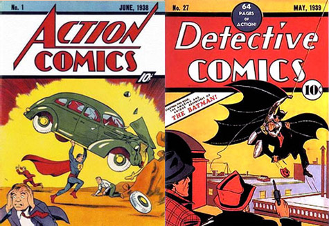
Think back to 1939, the year Batman debuted in Detective Comics #27, and a year after Superman made his big splash. The Great Depression still bogged down the world, war clouds formed on the horizon, and the little guy seemed adrift. Superman, for all of his early adventures fighting gangsters, was, basically, an alien who could bend steel. He operated in the daylight and his suit reflected the buried optimism lurking just below the surface of the American consciousness: bright blue leotards, red trunks, flashy red cape, red “S” on a yellow shield. His feats of strengths pretty much spoke all you needed to know about how Superman works—out in the open, for all to see.
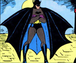
Batman was a hero of an entirely different color. Notice the cape, cowl, and trunks are all black with blue highlights to show texture, gray leotards, a muted yellow belt, and the bat insignia without any yellow oval around it. Despite the bright yellow background—probably used as an attention-getting device—this was a hero that belonged in the dark.
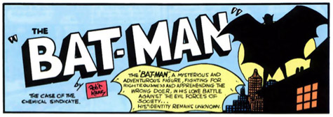
Want proof this was a night-time creature out for justice? Here’s the first image you see upon opening the cover of that issue. There he stands, atop a building, full moon obscuring all but the silhouette of the Bat-Man.
The Elements of the Batsuit
Bob Kane and Bill Finger came up with the initial design. Although obviously modeling him after Superman, the two comicsters wanted Batman to be different. They drew inspiration from The Shadow, Zorro, and The Phantom, and the design of the batsuit basically hasn’t changed in 72 years. Bruce Wayne wears a cowl with pointed ears—the size and shape of which fluctuates over the decades. Along with the cowl is a large, flowing cape, scalloped to better resemble bat wings. The small purple gloves soon morphed into the larger black ones we now know, complete with three fins extruding out. In most cases, these fins are defensive weapons only. A yellow utility belt—yellow, I assume, for better contrast back in 1939 comic books—contains all the gadgets Batman needs to fight crime whenever he finds himself under attack. Underneath it all is a gray leotard/bodysuit with a bat insignia across the chest. For the first 25 years, the black insignia had no yellow oval backing it. All in all, a dark and imposing figure with which to fight crime.
The Zany 1950s
What changes emerged were variations on a theme. Indeed, from his debut in 1939 until the “new look” Batman emerged in 1964, the only changes were the wild and weird ones. Once the Silver Age started around 1956, the zany antics of your favorite heroes often ruled the day. It was also the influence of the Comics Code Authority, dictating that comic book villains could not be shown as benefitting from the crimes they committed. It’s safe to say that Detective Comics #27, as written, could not have been published in 1957.
But you do get:
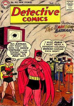
Rainbow Batman. And Jungle Batman. And let’s not forget the Batman of Zur-En-Arrh, dubbed the “The Superman of Planet X” from 1958 (Batman #113). You see, that other Batman had superpowers.
While this is certainly one of the more wacky chapters in Bat-History, it’s not without charm. In 2006, Grant Morrison brilliantly brought back the phrase “Zur-En-Arrh” in his tales, consciously linking all the various phases of Batman’s history into one, more or less, coherent story. And the animated series, “Batman: Brave and the Bold”—a wonderfully retro joyride back to the Silver Age—basically brought that 1958 story to life.
“New Look” of the 1960s
Faced with declining sales by 1964, editor Julius Schwartz and artist Carmine Infantino brought Batman most of the way back to where he started: as a detective. Gone was the wacky stuff (bye, Ace, the Bat Hound), and the science fiction elements (bye, Planet Master). Back in focus was Batman the Sleuth and, with him, a newly styled costume, bowing in Detective Comics #327 (the three hundredth appearance of Batman).
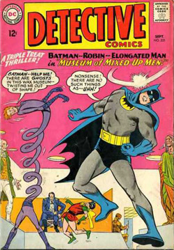
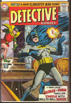
For all intents and purpose, this was the beginning of showing that Batman actually was a man.
The Adams/O’Neal Revamp: Back to the Shadows
By the late 1960s, the campiness of the television show had permeated the comics and we were back to the zany. It’s a true sign of strength in the character when Batman can be serious and funny and it not be all that weird. Nonetheless, writer Dennis O’Neil and artist Neal Adams did the same thing Schwartz and Infantino had done a few years before: bring Batman back to his darker, grimmer roots, only, this time, they really kept him there.
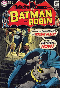
While it isn’t a part of his costume, per se, Adams drew Batman to be a much leaner, more trim fighter. Jim Aparo, the penciller for the Batman team-up book, The Brave and the Bold, kept that thinner Batman look. This is the one I grew up reading, and it is Aparo’s Batman by which I judge all other incarnations.
Frank Miller, Pouches, and the One Big Variant
Frank Miller’s stunning The Dark Knight Returns series is nothing less than the demarcation line in the history of Batman. There is Batman the way he was pre-Frank Miller, and we’re all living with Batman as changed by Frank Miller. If Adams and O’Neil wanted to return Batman to his grim roots, Miller took him a notch or two further.
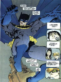
By the end of the story, Miller also brought back the black to Batman’s cape, cowl, trunks, and boots.
The Dark Knight Returns and Watchmen by Alan Moore and Dave Gibbons paved the way for a new, grittier, more violent turn in comicdom. Character costumes naturally followed, and we got the one, true change in Batman’s appearance. Interestingly, it was not Bruce Wayne under the cowl. In a year-long story arc, Bruce Wayne’s Batman is defeated by Bane, a hulk-like figure who breaks Batman’s spine across his knee.
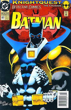
Yellow, armored shoulder pads and a yellow belt thingy across the left thigh adorn the look (why, exactly, did comic artists think belts on thighs was cool?). The “cape” now is less a cape than+ these protruding armored bat-wing things. Ironically, the very thing Bill Finger told Bob Kane, back in 1939, about true bat wings on the costume (they’d get in the way during a fight) seems to have been forgotten now. That device on Valley’s left wrist shoots out bat-shaped razors since he doesn’t care too much about maiming the bad guys. The mask completely covers the face, rendering the “man” part of Batman obsolete. Valley basically forgot the humanness of Batman, something Bane himself points out during his defeat at the hands of Valley’s Batman.
Jim Lee and the Neo-Classic Batsuit
Once Bruce Wayne recovered from his spinal injury and reclaimed his mantle as the one, true Batman, the more recognizably classic design returned and, to date, hasn’t left again. Taking a cue from Valley’s modernization of the batsuit, as well as the drive to make the exploits of these costumed heroes more real, newer artists have gone out of their way to depict the batsuit as being a uniform of sorts, complete with armor and leather. This isn’t a man dressed in a leotard fighting crime. This is a soldier, decked out with the latest technology that helps him do his job fighting crime.
Jim Lee illustrated “Hush,” one of the best story arcs in Batman history. While Jeph Loeb’s writing is superb, Lee’s drawings really, for the first time, let you see that Batman is just a guy dressed up in a costume. You can see wrinkles in the fabric, and, naturally, you can see his ears underneath the cowl. And the pouches are still there.
With the recent reboot of the DC Universe, Batman’s costume got a face lift.
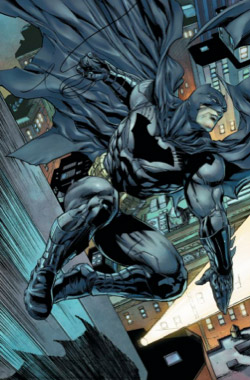
You might think that the revamping of the entire DC lineup would have been a grand time to change the look and feel of Batman. Some fans have actually complained. The thing is, though, when you picture Bob Kane and Bill Finger, sitting together in a New York apartment, dreaming up this character and the way he’d look with his sleek lines and brooding visage, they pretty much got it right from the start. Why bother changing?
Scott D. Parker is a professional writer who discusses books, music, and history on his own blog, and is a regular columnist for Do Some Damage.

We all know that Aparo’s is the one true Batman. Of course, I maintain that Clark Kent still works for WGBS.
not sure what you mean about Batman having a “uniform”. By definition a uniform must be one by several people and be identical among those people.
it’s time to bring back the yellow oval and the shorts – hell the entire Aparo/Giordano look should be brought back. Really tired of this “loaded for bear” BS. How about we restore the fantasy to our fantasy?
People often say that about the pouches, but they forget Adam West had pouches.. Personally I prefer the rigid square ‘seatbelt buckle’ compartments of the DCAU belt.
(and speaking of preference, anyone who hates the trunks hates Batman! There I said it)
Thank You!
That is a reply to ColdFusion by the way